Overview
Joey’s Vineyard is a company that produces and sells high-quality wine to their customers where each product of theirs sold a portion of the proceeds go towards organizations that are dedicated to wildlife preservation. Inspired by the time of early 2020 when bush fires raged through Australia destroying thousands of the wildlife’s homes they chose to use their company to instead not only focus on producing high-quality wine, but also spread awareness and help fund wildlife preservation organizations like WWF, The Nature Conservancy, Natural Resources Defense Council, and many others.
Acknowledgements
Graphis New Talent Annual 2021 Silver Award
Challenge
Although what Joey’s strives to accomplish producing wine and protection of wildlife their main problem is attracting two different types of audiences while trying to stand out from their competitors. In order to be successful, Joey’s branding identity has to appeal to both types of the audiences: wine consumers and animal lovers keeping the two priorities balanced. Both types of audiences need to be reached with the right logo, colors, typography, and brand voice.
Approach
To solve this problem in order to balance out the two priorities and stand out more than their competitors, Joey’s represents a unique type of company that caters to both and shows their individual value. Joey’s focuses on being reliable/trustworthy for their cause, attentave with their wine quality, respectable to all their customers, passionate in what they stand for, and caring for both their human friends and their furry friends. Using specific fonts, colors, and the products themselves they achieved the goal of a brand that remains neutral between the two priorities appealing to the elegance associated with wine and the compassion with wildlife protection.
taglines-03
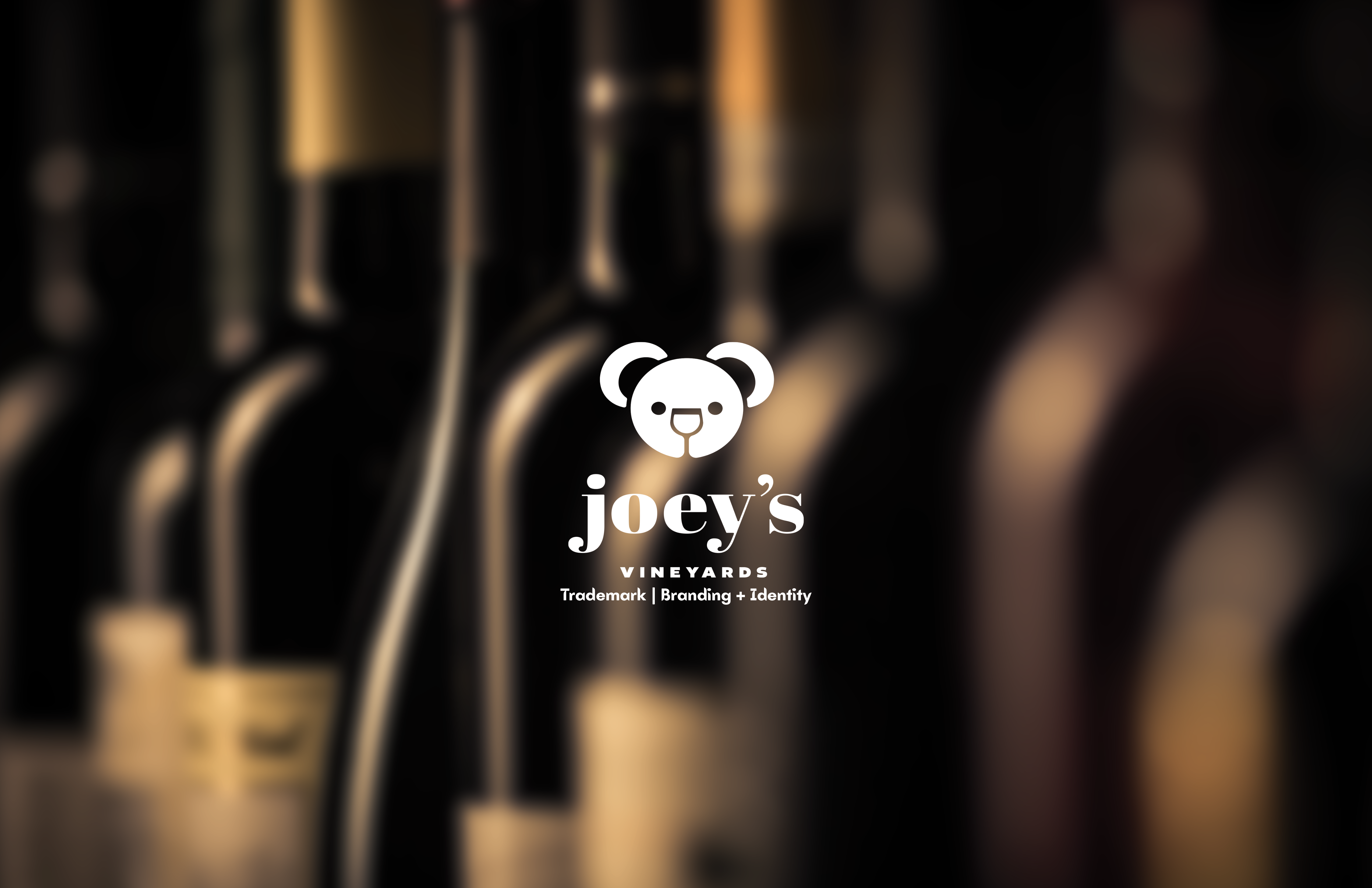
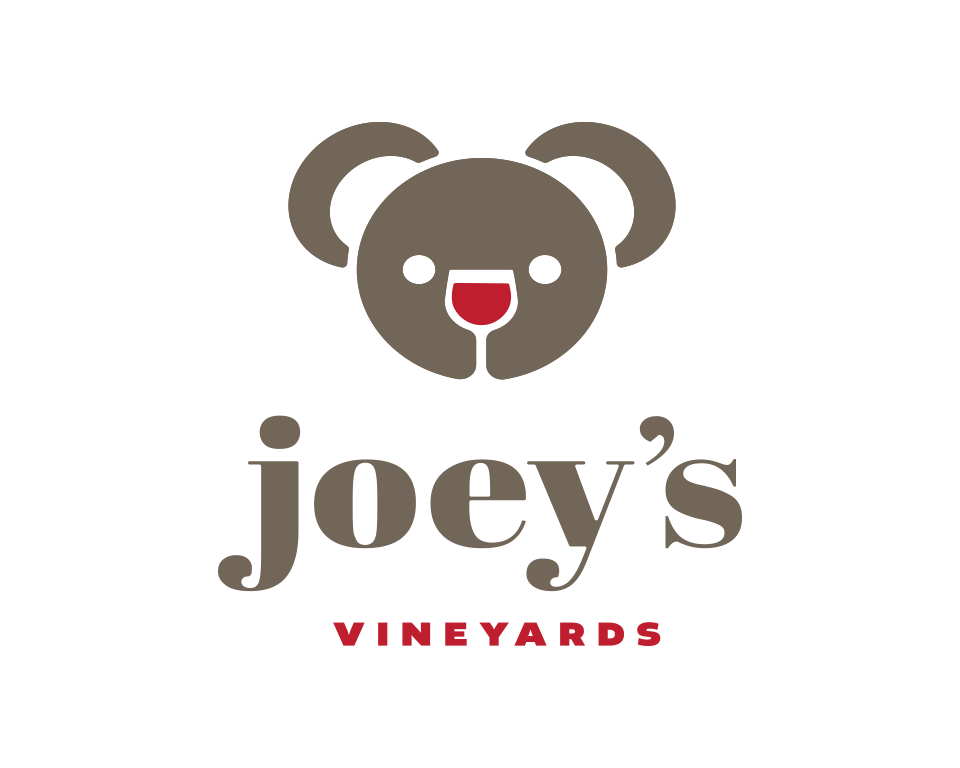
Joey’s Primary

Joey’s Secondary
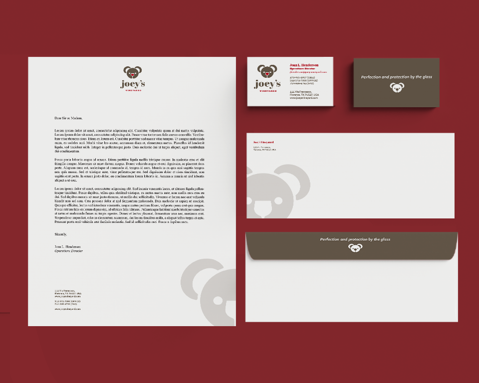
Joey’s Vineyard Stationery
Joey’s Storefront

pexels-taryn-elliott-7607996
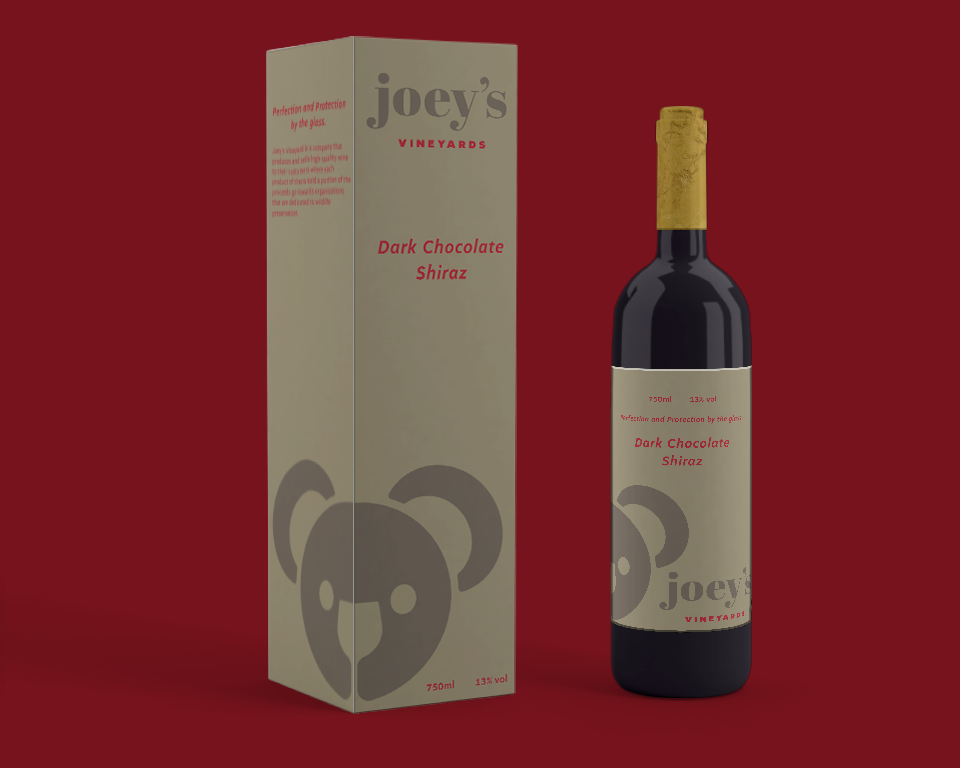
Bottle Packaging
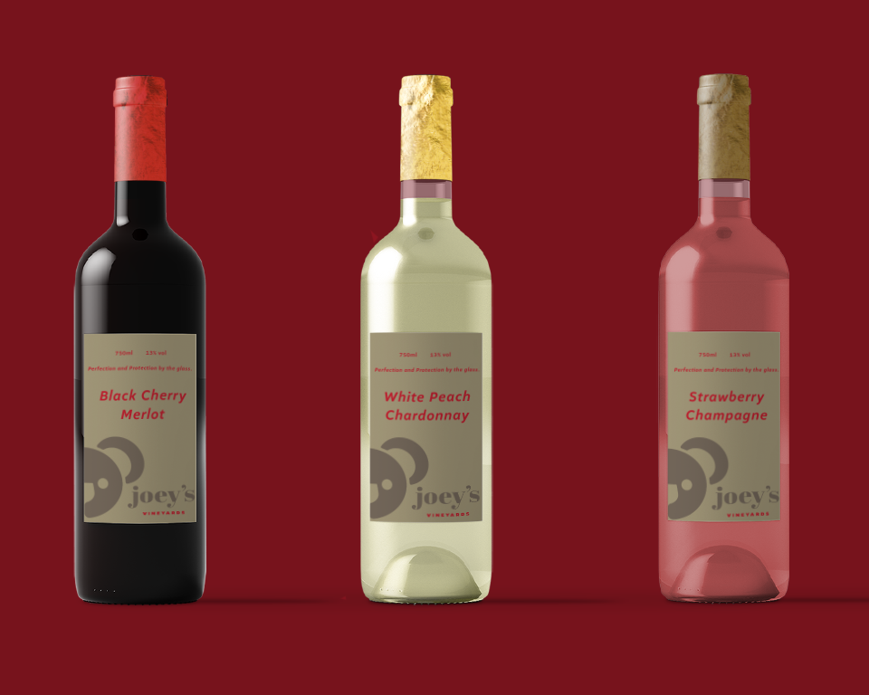
Other Products
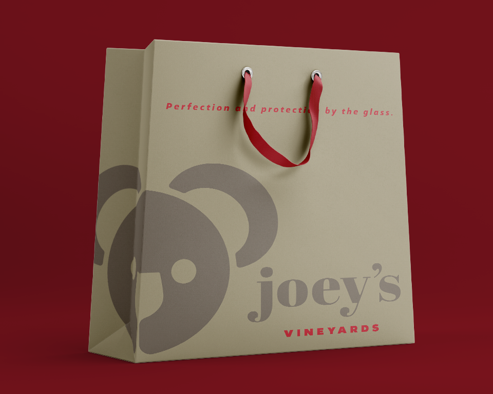
Shopping Bag
pexels-tim-mossholder-2331884
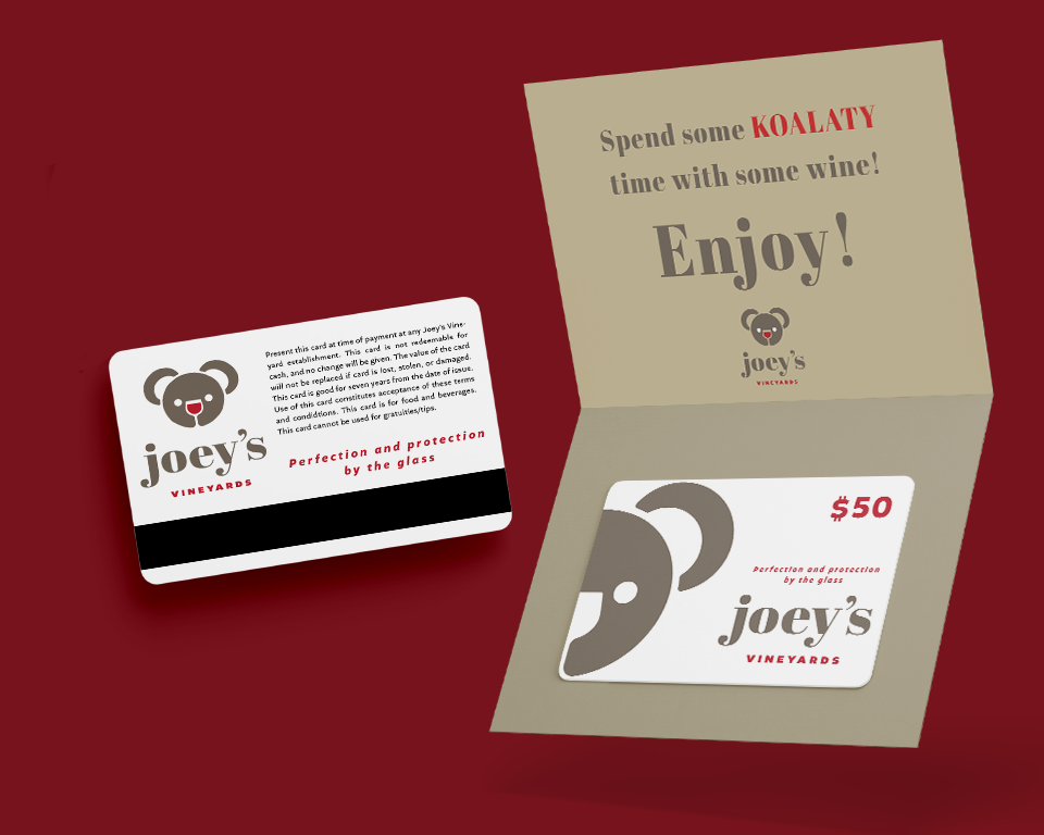
Gift Card
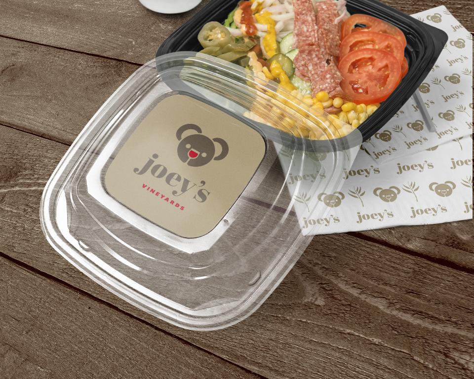
To-Go Packaging
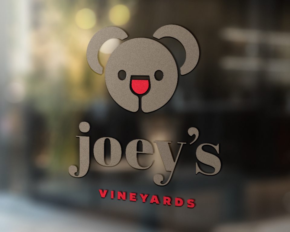
Window Sign
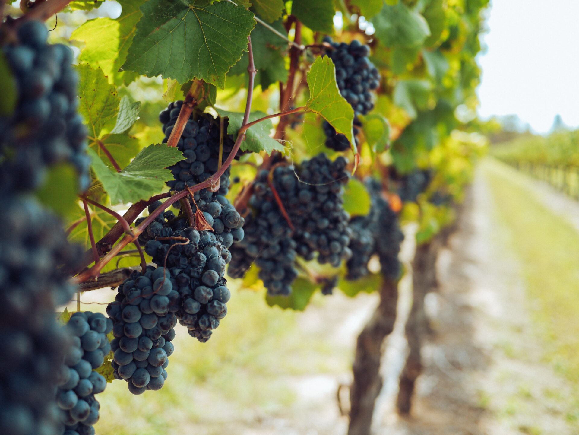
pexels-grape-things-3840335
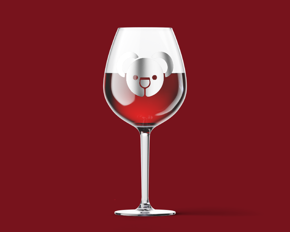
Wine Glass
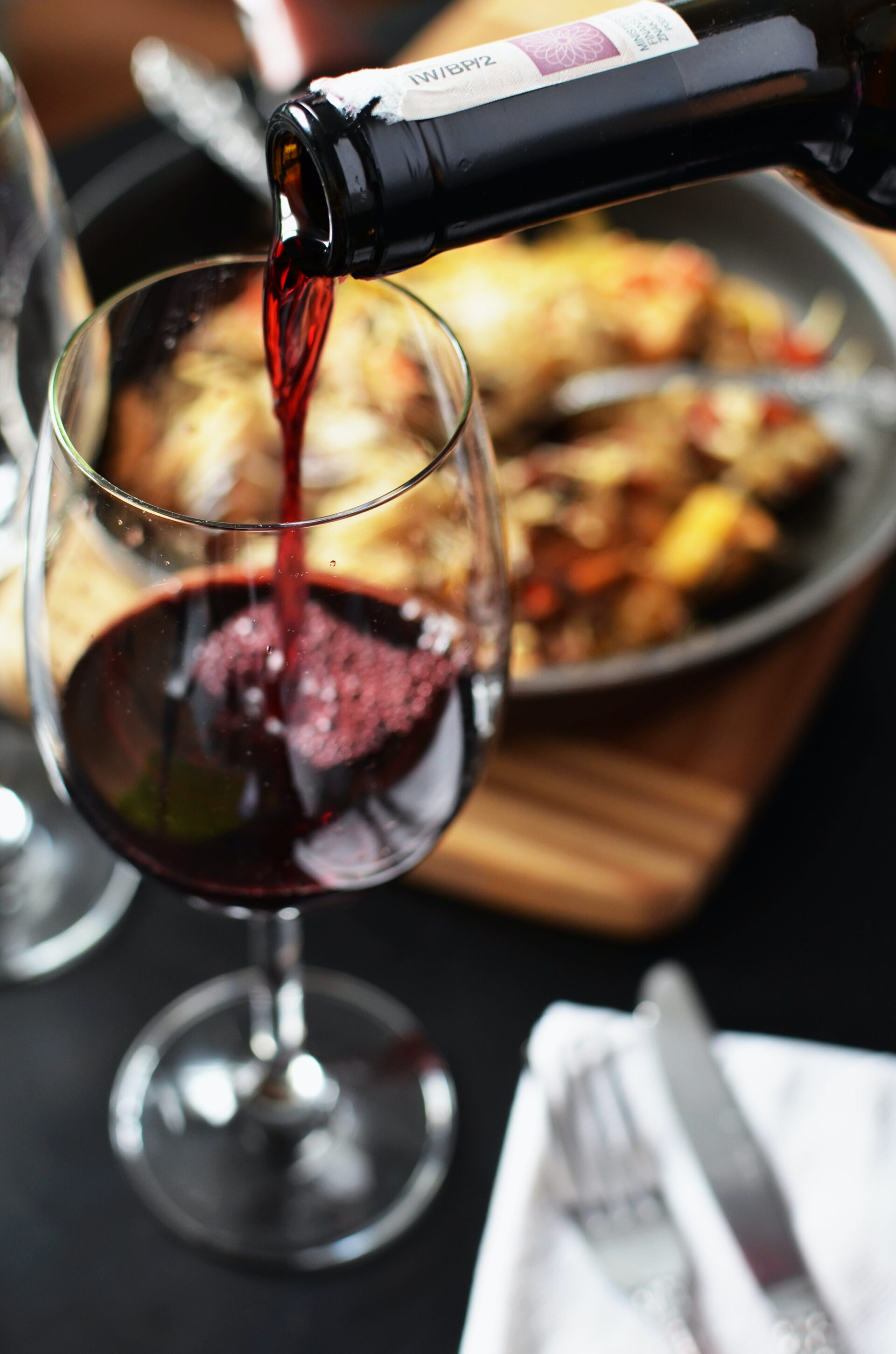
pexels-breakingpic-3044
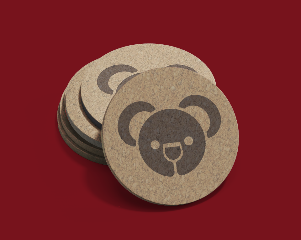
Coasters